The Consideration for an Eco-friendly Interior Design

Interior design gives a new look and ambience to a home. And, if carefully designed, it contributes to the reduction of environmental impact. However, interior designing also considers sustainability. This is through the responsible use of materials, furnishings, energy, and household items. It’s not all about sacrificing beauty or comfort when planning an environmentally friendly home. Sustainability can be integrated into a desirable and usable interior, provided there is good planning.

Choosing Sustainable Materials

Here are some of the materials for interior design that supports sustainability:

1-Natural Materials

Natural materials are long-lasting materials which reduce replacement frequency.

2-Reclaimed Materials 

Wood, furniture and decorative items that can be reused and reclaimed can add to the unique look of an interior. Aside from that, it also minimizes the use of new materials. Another older table or cabinet may be able to be put to use after repair, refinishing or a new layout.

Creating a Long-Lasting Design

A stylish modern eco-friendly living room featuring reclaimed wood furniture, natural textiles, indoor plants, bamboo accents, large windows with natural sunlightSometimes a durable furniture piece will be more expensive in the beginning. But, if it can be used for years and years without needing to be replaced. With that, you can be more sustainable than someone who has to replace their items over and over.

Homeowners should look for quality in construction, the repairability of the house and its lifespan before buying.

Conclusion

Achieving an eco-friendly interior can be done through the combination of useful, elegant, and sustainable design ideas. The use of long span materials, reusing the existing ones, and maximizing natural light produces a room that is eco-friendly and elegant.

Open Plan vs. Broken Plan: Which Layout Works Better for an Extended Home?

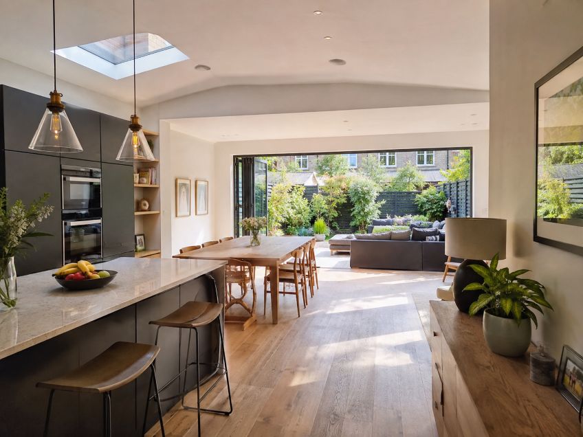
rear house extension

Open-plan extensions remove internal barriers to create one shared kitchen, dining, and living area. Broken-plan layouts keep much of that openness but use partial walls, glazing, shelving, level changes, or furniture to define zones. Both can work well in an extended home, but they solve different problems.

Planning the layout before construction matters because wall removal, openings, floor levels, services, and glazing can affect both structure and later flexibility. Homeowners speaking with house extension companies in London should decide early whether they want one uninterrupted space or more separation. Approved Document A from the Ministry of Housing, Communities and Local Government covers structural elements such as walls, floors, roofs, and foundations, so altering load-bearing walls may require structural design rather than a simple interior change.

What Does Open Plan Do Best?

The main advantage of open plan is visual connection. A combined kitchen, dining, and living space can feel larger because sightlines continue across the room. It also suits entertaining, since people can cook, eat, and talk without being divided by doors or full-height walls.

Daylight is another strength when an extension includes large doors, rooflights, or generous windows. Guidance from BRE Group explains that good daylighting can make interiors more attractive and reduce the need for electric lighting during the day. In an open layout, rear glazing may also help light travel farther into the older part of the house.

For families with young children, openness can make supervision easier. The same feature becomes less useful when several people need the space for different activities at once.

Where Does Open Plan Start to Struggle?

Noise travels easily through one large room. Television, cooking, appliances, conversation, and children’s activities may compete. Approved Document E from the Ministry of Housing, Communities and Local Government notes that room layout should be considered at the design stage to avoid placing noise-sensitive spaces beside noisier ones. That principle matters when one room must serve many purposes.

Privacy can also be limited. Someone working from home may struggle to take a call while another person cooks or watches television. A busy kitchen also remains visible from the sitting and dining areas.

Heating by activity can be less precise in one large space. The Energy Saving Trust explains that zone controls allow different parts of a home to be heated at different times. Open rooms provide fewer physical boundaries for separate comfort zones, although good heating design can still make them comfortable.

Why Broken Plan Is Gaining Attention

Broken plan keeps visual connection while creating clearer zones. A glazed screen can separate a study from the kitchen. A half wall may shield a sofa from cooking activity. Shelving, changes in floor finish, or ceiling height can also mark different uses without closing the room completely.

This can improve privacy and reduce visual clutter while keeping a connected feel. It may also suit households whose needs change throughout the day, such as families that need space for homework, remote work, meals, and relaxation.

The Royal Institute of British Architects (RIBA) project directory includes London homes where architects have used glazed partitions and broken-plan arrangements to bring light into darker areas while adding separation. These examples show that dividing a room does not always mean losing daylight.

What Does Broken Plan Give Up?

Broken plan usually needs more detailed planning. Screens, partial walls, steps, storage, and doorways all affect circulation. Poorly positioned features can make the space feel fragmented rather than flexible.

Furniture choices may also become more limited. A fully open room can often be rearranged more freely. Built-in dividers or level changes make a stronger commitment to one layout. Bespoke glazing or joinery can also add cost and complexity.

What Changes When Structure Is Decided Early?

Early layout decisions can protect future options. If a homeowner may want a glazed divider later, the ceiling, floor, heating, lighting, and electrical plan can allow for it from the start. Examples published through RIBA also show how hidden steelwork and engineered openings can be used to achieve large open spaces.

Ventilation deserves similar attention. Approved Document F from the Ministry of Housing, Communities and Local Government provides statutory guidance for ventilation in dwellings in England. The position of extraction, windows, and internal divisions can influence how the finished space functions.

Which Layout Fits Which Household?

Open plan often suits households that entertain frequently, value long sightlines, want easy supervision, and prefer flexible furniture arrangements. It can work especially well when the extension becomes a bright social space connected to the garden. This approach also fits with current indoor-outdoor living ideas, where large glazed doors and a clear connection to patios or gardens help the interior and exterior feel like parts of the same living space.

Broken plan may be better for families that need more privacy, acoustic separation, work-from-home space, or clearer boundaries between cooking and relaxing. It offers openness without making every activity visible from every part of the room.

Neither approach is automatically better. The stronger choice reflects how the household actually lives. An extension offers a chance to consider circulation, daylight, heating, noise, and privacy together. Deciding those priorities before structural work begins can make the finished home easier to use and easier to adapt later.

Fabric or Vinyl Backdrops: Which Material Fits a Designed Event Space?

Printed backdrops reflect ambient light, so their surface finish can influence how colors, furniture, and people appear in photographs. For interior designers, the choice between fabric and vinyl is therefore more than a production decision. It affects how successfully the display fits the atmosphere and visual language of the venue.

Designers preparing New York installations may use a local producer for a Step and repeat banner NYC, particularly when schedules require nearby proofing, production, or delivery. Before ordering, however, the designer should compare the materials under conditions resembling the actual venue. A backdrop that looks balanced in a studio can respond differently to chandeliers, spotlights, windows, and colored walls.

Designer Compares Matte Fabric and Smooth Vinyl

The Case for Fabric: Softness and Visual Integration

Fabric usually offers a soft, low-sheen appearance that complements upholstered seating, curtains, rugs, and other textile elements. Its woven texture can make a branded photo area feel integrated into a lounge, wedding reception, fashion presentation, or hospitality interior. The subdued surface is especially useful when the desired atmosphere is warm, refined, or residential.

Reduced surface reflection is also valuable around cameras. Guidance from Canon Europe explains that matte print surfaces reduce glare and help tones appear more even under strong lighting.Canon’s discussion of print finishes concerns photographic paper, but the same optical principle helps designers understand why a matte textile surface often photographs more consistently than a shinier material.

Fabric does introduce practical challenges. Folding can produce creases, while loose tension may create waves that become visible under side lighting. A tensioned frame can correct much of this, but the graphic must be sized accurately. For storage, rolling or carefully folding clean material protects the printed face. The Smithsonian Institution notes that museum textiles are commonly rolled or placed in protected storage to limit abrasion, handling, light, and dust. Its textile-storage guidance reinforces the value of careful handling when a backdrop is intended for repeated use.

The Case for Vinyl: Smoothness and Practical Control

Vinyl presents the opposing argument. Its relatively smooth printable face can give logos, geometric patterns, and saturated colors a crisp, direct appearance. This can work well in contemporary venues featuring glass, polished stone, metal, lacquered furniture, or other hard architectural finishes. The material is also useful when the design calls for a clean commercial look rather than a soft decorative layer.

Maintenance is generally straightforward because the surface does not absorb minor moisture as readily as many textiles. The Vinyl Institute describes flexible vinyl as durable and moisture resistant in applications such as wall coverings and roofing. Its overview of PVC in design and construction is broader than event graphics, yet it identifies properties that explain vinyl’s appeal for installations involving transport, handling, and repeated setup.

The tradeoff is reflectivity. Direct fixtures may create bright patches, especially when the vinyl has a noticeable sheen or is not pulled flat. Creases from tight folding can also catch the light and remain visible in photographs. Rolling the graphic around a suitable core is usually preferable, although a large roll requires more storage and delivery space.

How Color and Lighting Change the Comparison

Neither material guarantees identical color in every room. Adobe explains that a printed image changes in appearance under incandescent, fluorescent, and indirect daylight because print reflects the light falling on it. Adobe’s print-preparation guidance also recommends evaluating a proof under lighting similar to its final viewing environment.

Fabric may slightly soften fine details because its weave adds visible texture. Vinyl can retain a sharper graphic impression, although glare may reduce apparent contrast from certain camera positions. Dark designs deserve particular attention because reflections and folds can be more obvious across large areas of solid color.

A practical lighting test should include front, side, and overhead illumination. Designers can place a camera at the expected guest position, then check the backdrop from several angles. Moving a light away from the direct reflection path often reduces hotspots. Diffused fixtures can spread illumination more evenly, while excessive side lighting may emphasize fabric ripples or vinyl creases.

Compatibility With the Designed Interior

The surrounding finishes should guide the final comparison. Fabric can echo velvet chairs, linen table settings, acoustic panels, or drapery. Vinyl can relate effectively to acrylic signs, glossy counters, metallic frames, and modern architectural surfaces. Designers exploring printed graphics in minimalist interiors can also consider how texture, tone, and restrained visual details help a display complement the room. Contrast may be intentional. A matte textile background can calm a highly reflective venue, while a smooth vinyl graphic may add definition to a space dominated by soft furnishings.

Scale matters as well. Large patterns may compete with statement furniture or detailed wall treatments. A quieter repeat, wider spacing, and controlled color palette usually allow guests to remain the visual focus. Designers should review a physical sample beside the actual upholstery, paint, flooring, and lighting whenever access permits.

A Balanced Material Decision

Fabric is often the stronger choice for softness, low reflection, and compatibility with layered interiors. Vinyl answers with crisp presentation, wipeable maintenance, and a surface that suits structured contemporary settings. Each advantage can become a limitation when the lighting, transport method, or support system is poorly matched.

The better backdrop ultimately depends on the venue, desired atmosphere, available budget, and expected reuse. A careful decision considers the whole installation rather than judging the printed graphic alone. When material samples, lighting tests, camera positions, furniture, and architectural finishes are reviewed together, the finished backdrop is more likely to feel like a deliberate part of the space.

Fabric Backdrops or Digital Walls: Which Works Better in Event Interiors?

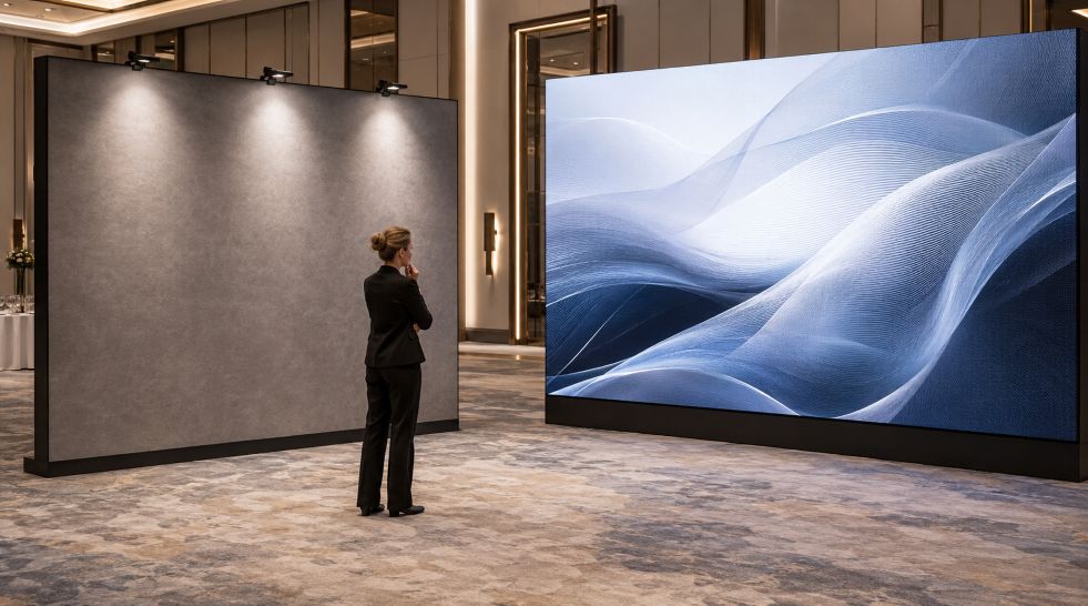
Designer Evaluates Fabric Backdrop and LED Wall

Event interiors influence how guests experience a space and how that experience appears in photographs. For designers and planners, choosing between a printed fabric backdrop and a digital wall is therefore more than a decorative decision. Each option affects lighting, movement, branding, floor space, installation, and the atmosphere of the room.

Traditional installations remain common because they offer visual predictability. A NYC step and repeat arrangement, for example, uses a recurring pattern so branding remains visible across individual portraits and larger group photographs. Once the artwork, dimensions, and placement are approved, the display stays consistent throughout the event without requiring content management or electronic controls.

The Case for Printed Fabric Backdrops

Fabric backdrops are relatively straightforward systems. A printed panel is stretched across or attached to a supporting frame, creating a dedicated background for entrances, interviews, photographs, or presentations. Because the content is fixed, operators do not need to manage playback software, signal sources, or changing files during the program.

This simplicity can help events with limited technical staff. After installation and inspection, the main concerns are physical: keeping the material smooth, stabilizing the frame, and maintaining a clear area for guests and photographers. Venue rules still matter. Guidance from the National Fire Protection Association notes that loosely hanging fabrics and decorative materials may need to meet specified flame-propagation performance criteria, so planners should confirm local requirements and venue policies.

Printed surfaces also provide consistent branding in photographs, provided the artwork is prepared correctly. Adobe explains that cameras, monitors, and printers reproduce different ranges of color. A color-managed workflow helps teams anticipate these differences, although lighting and the final print material still influence the visible result. Testing a physical sample under venue lighting can reveal weak contrast, unexpected color shifts, or reflections before production.

There are limits. A fabric wall cannot switch from sponsor graphics to a speaker introduction, animated artwork, or a live social feed. If information changes after printing, the panel may require modification or replacement. Creases, loose tension, and unsuitable finishes can also become noticeable when photographed with direct flash.

The Case for Digital Walls

Digital walls take the opposite approach. Their principal advantage is flexibility. They can show motion graphics, videos, schedules, changing sponsor sequences, live camera feeds, and visual themes that shift between parts of a program. One installation can support an opening presentation, an awards segment, and an evening reception without physically replacing the display surface.

That versatility can strengthen contemporary interiors, especially technology conferences, product presentations, gaming events, and immersive exhibitions. Animated material creates movement and can turn a plain room into an active visual environment. Content can also respond to speakers, music, or audience participation, giving designers more control over changes in mood.

Technical flexibility introduces additional planning. AVIXA, the Audiovisual and Integrated Experience Association, identifies viewing distance, content type, resolution, screen size, ambient light, and physical obstructions as important considerations in video-wall design. A wall that looks sharp from the back of a ballroom may reveal its pixel structure when guests stand close to it. Bright content can dominate a dim reception, while a screen with insufficient brightness may lose impact in a sunlit atrium.

Digital installations also need electricity, data connections, processors, mounting systems, and trained technicians. Equipment depth, ventilation, cable routes, and access for maintenance must be incorporated into the interior plan. Reports from the U.S. Department of Energy further show that screen size and brightness controls affect electricity use. Energy requirements should therefore be considered alongside rental costs and visual performance.

Lighting, Space, and Photographic Results

Lighting often reveals the clearest difference between the two options. Fabric reflects the light directed toward it, allowing a photographer to shape exposure with fixtures or flash. Matte material can provide a controlled background, but folds and uneven front lighting may create shadows. Digital walls emit their own light, producing vivid color while potentially causing exposure differences between the display and people standing in front of it.

Space requirements depend on the system. A tensioned fabric frame can be thin, although photographers need enough distance to frame groups without capturing the backdrop edges. Digital walls may require more structural support and space behind or beside the installation for equipment. Both choices must preserve entrances, exits, accessible routes, and comfortable guest circulation.

Matching the Display to the Interior

Fabric tends to suit interiors where visual restraint and photographic consistency are priorities. Galleries, weddings, formal dinners, press arrivals, and heritage venues may benefit from a surface that quietly complements the architecture and furnishings. Designers can apply principles associated with layered textures in interior design by coordinating the backdrop with wood, stone, metal, textiles, and other finishes already present in the venue. This approach introduces depth and color without adding motion to an already detailed room.

Digital walls fit interiors designed around transformation, multimedia, or audience interaction. Still, neither medium has universal superiority. A moving display may distract from ornate architectural features, while a static background may feel limited during a program built around changing content. Hybrid designs can resolve this tension by combining a calm fabric photo area with a separate digital presentation zone.

A Decision Based on Purpose

The stronger choice begins with the event’s purpose. Planners seeking dependable photographs, uncomplicated operation, and a stable visual identity may prefer fabric. Teams that need changing messages, animation, or interactive content may find a digital wall more appropriate. Venue lighting, available space, technical support, safety requirements, and interior character should guide the final decision. When those conditions are evaluated together, either format can become a coherent part of the event rather than an isolated display.
Modern Interior Design Trends That Blur the Line Between Indoor and Outdoor Living

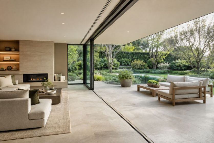
Seamless living room to garden terrace

More than 300 residential architecture firms contribute to the quarterly Home Design Trends Survey run by the American Institute of Architects. Their continuing attention to property features reflects a clear design priority: homeowners increasingly view terraces, balconies, and gardens as functional parts of the home rather than separate decorative zones.

The strongest indoor-outdoor schemes create visual continuity while preserving safety, comfort, and year-round usefulness. Large openings, repeated materials, coordinated furniture, and balustrades supplied by luxury screens can all contribute to that effect. The following trends show how designers are making the boundary feel lighter without pretending that climate, structure, and building rules do not exist.

1. Wider Glazed Openings

Sliding, folding, and pivoting glazed doors can replace a visually heavy wall with a broad view of a patio or garden. When open, they make movement between cooking, dining, and seating areas more direct. When closed, they retain the sightline while providing a weather barrier.

Placement matters as much as size. The United States Environmental Protection Agency explains that natural ventilation moves outdoor air through open windows and doors, driven by wind and temperature differences. Designers therefore consider opening direction, cross-ventilation, shade, and local weather instead of treating large glass panels as a universal solution.

2. Continuous Flooring and a Level Threshold

Matching the tone, scale, or laying pattern of indoor and outdoor flooring makes two zones read as one composition. Porcelain tile, stone, and concrete-look surfaces are often chosen because related finishes can be specified for different exposure conditions. The outdoor product still needs suitable slip resistance, drainage, and durability.

A near-level threshold strengthens the connection, but water management and door-system detailing remain critical.

3. Transparent Guarding Around Changes in Level

Raised terraces and balconies introduce a practical conflict. Solid guarding can interrupt a garden view, yet an unprotected edge is unsafe. Glass balustrades offer a middle path by defining the boundary with relatively little visual weight, allowing the eye to continue toward planting, water, or the wider landscape.

Transparency does not remove regulatory obligations. The UK government’s Approved Document K provides guidance on guarding and glazing intended to protect people from falls, collisions, and impact. Exact height, glass specification, fixings, loads, and installation should be determined for the property by qualified professionals.

4. Repeated Materials and Colours

A restrained palette helps rooms and gardens feel related. Timber used on kitchen cabinetry might reappear in exterior seating, while dark metal window frames can be echoed in planters or lighting. Thoughtfully layered textures in modern living spaces can add depth while maintaining continuity between interior and exterior areas.

Exterior exposure should guide selection, so an indoor finish may need a durable outdoor-rated counterpart.

5. Biophilic Layers Indoors

Plants, daylight, natural textures, and framed views bring cues from the landscape into living areas. The World Green Building Council describes biophilic design as connecting people with nature inside and outside buildings, and links access to nature with well-being, clearer thought, and reduced stress.

The most convincing approach responds to the actual site. A window may frame an established tree, indoor planting may repeat species seen outside, and furniture can be arranged toward the view. This feels more grounded than adding greenery without considering light, maintenance, or circulation.

6. Outdoor Rooms with Interior Comfort

Covered terraces increasingly borrow the planning language of interiors. Defined dining and lounging zones, layered lighting, weather-resistant textiles, and an outdoor kitchen can support longer use across the day. A pergola or deep roof overhang also provides shade and makes the transition from enclosed room to open garden more gradual.

Comfort still depends on location. Wind direction, solar exposure, privacy, drainage, and storage should shape the layout. Flexible furniture and movable shade often perform better than a fixed arrangement because households can adapt the space to changing seasons and occasions.

7. Coordinated Sightlines and Lighting

Good indoor-outdoor design is experienced from several positions, including the entrance, sofa, dining table, and upper floor. Aligning doors with landscape features and keeping barriers visually quiet can create depth. After dark, gentle exterior lighting prevents the glazing from becoming a black mirror and keeps the garden present.

Low-level path lights, shielded fittings, and focused illumination can support movement while limiting glare. A coordinated plan creates a calmer view.

A Boundary That Still Performs

The future of indoor-outdoor living is likely to be less about removing every boundary and more about making each boundary work intelligently. Transparent guarding, generous openings, repeated finishes, planting, shade, and lighting can create a strong sense of connection. Successful projects balance that openness with weather protection, privacy, maintenance, accessibility, and structural safety.

For homeowners, the useful question is whether the spaces support daily routines across changing conditions. With sound technical details, the home and landscape can feel like one considered environment while each performs its proper role. That balance turns a visual trend into lasting everyday value.